Small interventions, outsized friction. A 12-week self-directed usability study that diagnosed low predictability as the through-line — and used Figma redesigns to prove the fix.
Sole researcher and designer — study design, moderation, statistical analysis, and Figma prototyping. End-to-end ownership of a 12-week project.
Mixed-methods: heuristic evaluation surfaced candidate issues; performance testing quantified them; think-aloud protocol explained why they happened; redesigns fixed them; t-tests confirmed the improvement.
WhatsApp iOS. Six tasks covering core messaging interactions: group creation, message reactions, media sharing, status updates, voice messages, and contact search.
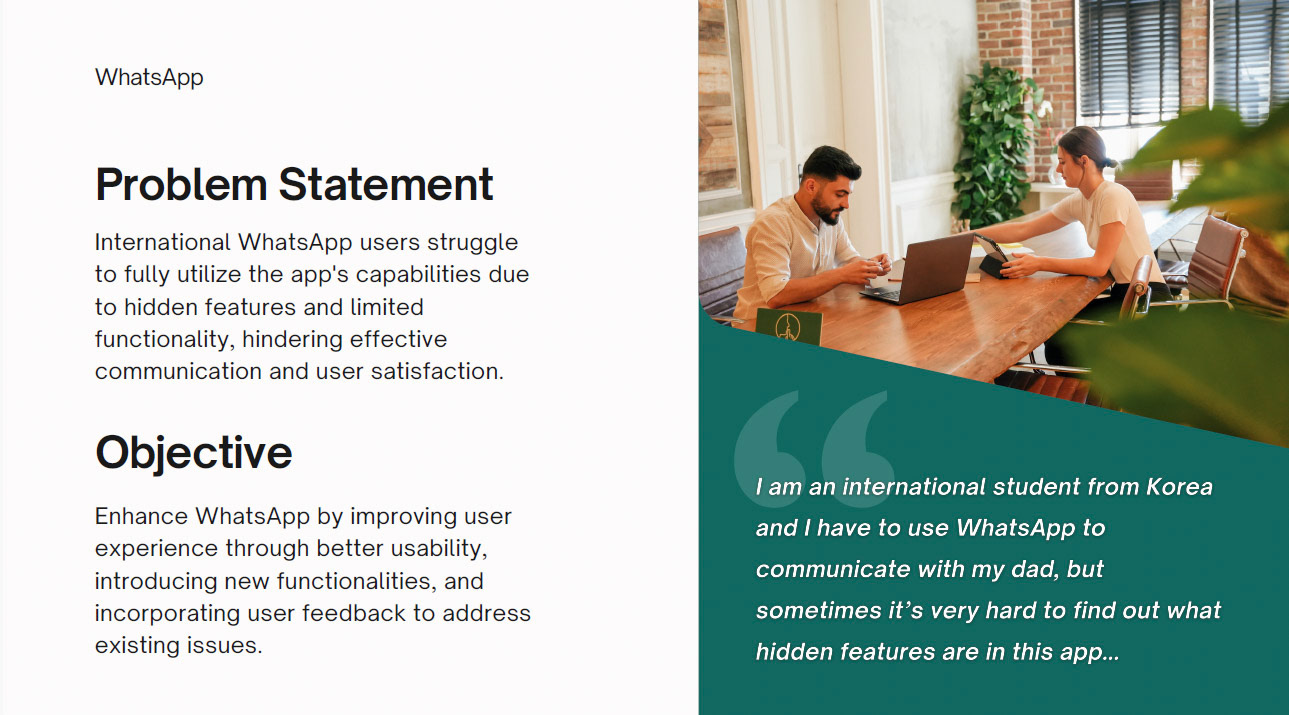
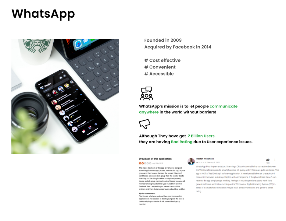
With over 2 billion users, WhatsApp is one of the most-used apps in the world. But ubiquity doesn't equal usability. Users adapt to friction — they work around it, forget it, or assume it's normal.
The research question: are there specific interactions where WhatsApp consistently imposes unnecessary cognitive load or time cost on users — and if so, can targeted redesigns measurably fix them?
I chose this as a self-directed study because it offered a contained, testable product — ideal for demonstrating end-to-end mixed-methods capability including quantitative validation.

Qualitative discovery → quantitative measurement → Figma redesign → statistical validation. Each stage informed the next.

I evaluated WhatsApp iOS against Nielsen's 10 heuristics to identify candidate usability issues. This gave the study a structured starting point and surfaced six tasks worth testing.
Six participants completed six tasks on the original WhatsApp. I recorded task completion time (seconds), error rate (number of incorrect actions), and subjective satisfaction (1–10 scale). Task order was randomized to control for learning effects.
Concurrent think-aloud during performance testing. Participants narrated their decision-making in real time. This surfaced the "why" behind the performance data — revealing that users were slowed not by technical failure but by unpredictable outcomes from familiar gestures.
"Low predictability" emerged as the through-line. Across all six tasks, users hesitated when they couldn't anticipate what would happen next — whether from inconsistent gesture affordances, buried navigation, or feedback that didn't match their mental model.
Five targeted redesigns addressing the highest-severity issues: improved gesture affordance signifiers, surfaced group creation flow, enhanced message reaction discoverability, clearer media attachment indicators, and visible status update entry points.
The same six participants completed the same six tasks using prototype flows on the Figma redesigns. Paired t-tests compared baseline vs. redesign performance. Four of five tested tasks showed statistically significant improvement (p < 0.05).
Across all six tasks, the performance data and think-aloud transcripts told the same story: users weren't confused by complex features. They were slowed by small, recurring moments of unpredictability — interactions that should have been obvious but weren't.
The pattern mapped cleanly to two of Nielsen's heuristics: consistency and standards and visibility of system status. WhatsApp's gesture vocabulary wasn't broken — it was inconsistently applied.
Each redesign addressed a specific predictability failure — making affordances explicit, surfacing buried entry points, and aligning system feedback with user mental models.
Added "New Group" as a direct action in the main chat list header (alongside the search icon), eliminating the need to navigate through New Chat → New Group.
Added a subtle emoji icon on hover/long-press preview that communicates the gesture affordance before the user commits — reducing failed short-presses.
Replaced the generic + icon with labeled icons (Photo, Document, Contact) visible in the attachment tray on first tap — no sub-menu navigation required.
Added a status ring affordance to a contact's profile photo (consistent with Instagram/Snapchat mental model), with a tap-to-add-status CTA in your own profile.
Added a one-time contextual tooltip explaining the lock-to-record gesture on first voice message attempt — dismissed after acknowledgment, visible to new users.
Compared pre-redesign vs. post-redesign performance across all participants for each task. Four tasks reached significance at p < 0.05. The fifth (voice messages) showed improvement but did not reach significance — likely due to the small sample (n=6) and the confound of prior familiarity.
With only 6 participants, the effect sizes needed to be large to clear the threshold — and they were. That's a meaningful signal: the usability failures were severe enough, and the redesigns targeted enough, that even a small sample returned confident results.

A "significant improvement" without a p-value is just a feeling.
This project was a deliberate demonstration of full-cycle mixed-methods capability — from qualitative discovery to statistical validation.
The most important thing I learned wasn't about WhatsApp. It was about how the methods compound: the heuristic evaluation told me where to look; the performance testing told me how bad the problem was; the think-aloud told me why it happened; and the t-test told me whether the fix was real.
That sequence — discovery → measurement → diagnosis → intervention → validation — is the same one I bring to every client engagement. The platform changes. The discipline doesn't.